In our work, colorforming is a term we use loosely to describe projects or moments in our projects where color and form are expressed as a simultaneous condition. Although not opposed to the use of white as a color, our investigations to date have primarily been focused on exploiting and advancing the fusion of color and form. Instead of expressing form in a ‘kind’ way through the use of white…. producing a ‘white lie’…. our colorform projects attempt to produce unexpected qualities through definable attributes, as opposed to passive abstraction.
Pita + Bloom
Colorforming
“We never really perceive what color is physically.” Joseph Albers

Colorforms toy
The word colorform is not defined in the dictionary; rather it is a concatenation of two words that encompass seemingly different aspects of design. Coincidentally ‘colorforms’ is also a toy comprised of a series of geometric shapes made out of die-cut vinyl in primary colors that can be attached to a background board, allowing for endless arrangements according to the user’s imagination. Although these constructs remain two-dimensional, the combination of color and shapes produces synchronized visual compositions. These compositions can be re-arranged and re-configured, but each has its own inherent set of colors. Similarly in our colorforming projects, the synchronized whole allows for multiple readings, yet it cannot be reproduced independent of the process that was used to construct it.
These projects aim to transcend personal tastes regarding color as such by coalescing form with color in a way that is innate to the project and to the process used to produce it. This fusing of form and color allows color to be considered not merely as an appliqué having the capacity to produce indexical and symbolic references. Rather, the notion of color is advanced as an attribute embedded within a physical form. We consider our colorforming work as a series of mannerisms – imitative but transfigured, lurid, exaggerated – aiming to produce an intricate level of architectural resolution. These mannerisms are identifiable in each project’s differing and sometimes overlapping techniques and strategies to produce form and color.
FORM
For most of our projects, form is generated from a process where two-dimensional figures and three-dimensional forms oscillate to the point where the source, whether it is two-dimensional or three-dimensional, is no longer recognizable.
The result can be thought of as a two-and-a-half-dimensional instance within the form making process. We are interested in the feedback between two-dimensional contours and three-dimensional volumes where familiar shapes are rendered unrecognizable, hence a form of ‘white lie’ that paradoxically relies on coloration.

KAWS Take the Cure / Jeff Koons’ Rabbit Parade Balloon / Aaron Curry’s Big Pink
Some examples from contemporary culture and art that have influenced our attitude regarding architectural form include the work of Brian Donnelly, Jeff Koons and Aaron Curry. Donnelly, also known as KAWS, creates familiar character silhouettes and subverts their instantaneous legibility by overlaying multiple characters within the figure. These characters are painted with precision in bright colors emphasizing their role as caricatures that have drifted from their original referents. Koons’ Rabbit Parade Balloon is a soft version of his otherwise rigid metal balloon sculptures that are known for challenging their implied materiality. Rabbit Parade Balloon, on the other hand, deceives the viewer’s expectations through its ‘literal’ materialization as an inflated balloon. Curry’s Big Pink works in the opposite way, suggesting the presence of a three-dimensional form through the intersection of two-dimensional shapes.

Wolfgang van Goethe’s color wheel 1810 / Joseph Albers’ Homage to Square 1966
COLOR
Our interest in color theory, focuses primarily on the effects of the technological shift from painted color to printed color. Wolfgang van Goethe’s color wheel from 1810 is an example of traditional color theory, exemplifying how primary colors can be mixed to produce a range of intermediate colors. Josef Albers’ work advances the traditional color wheel theory by studying complimentary colors in his painting. The series Homage to the Square focuses on the interaction of nested squares by looking at each color’s intensity, temperature and its vanishing boundaries. Modulating these properties in each instance imbued every painting in the series with a distinctive character. In the 1960’s Andy Warhol embraced the color palettes of RGB and CMYK that were created for output media such as television and computer monitors and for printing. In the 1950’s, Pantone developed a system for color matching by assigning each color a number and identity. The contemporary artist Ryan McGinness uses Pantone colors because of their autonomy and the wide range of selection in order to produce paintings and silkscreens that are comprised of a multiplicity of colors.
Our use of color works primarily with the current state that the color palette exists in, which is usually made for output media and printing. This is a move away from the language of complimentary colors functioning as mere representations. It favors the autonomy of color, or color as a readymade. Unlike selecting a paint chip to apply color to a surface of a building, we are looking at modes of printing directly onto building materials. This is ongoing research to examine how various modes of ‘printing’ can be used to develop formal articulation with color, hence, the term color-forming.
Projects
Balloon Frame - MoMA PS1 Long Island City, NY Invited Competition Finalist January, 2014

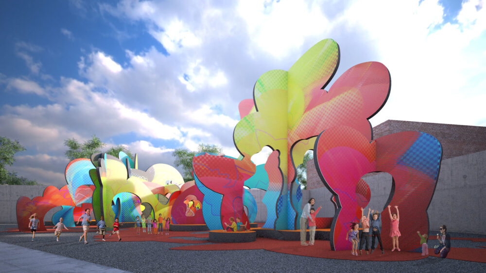
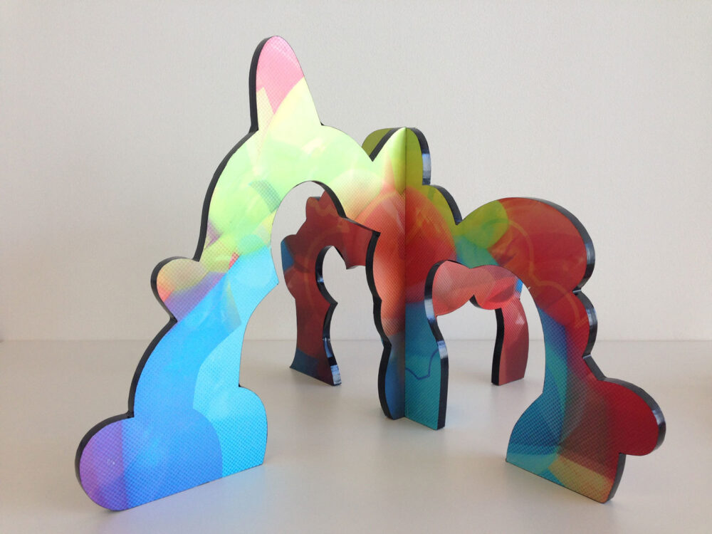
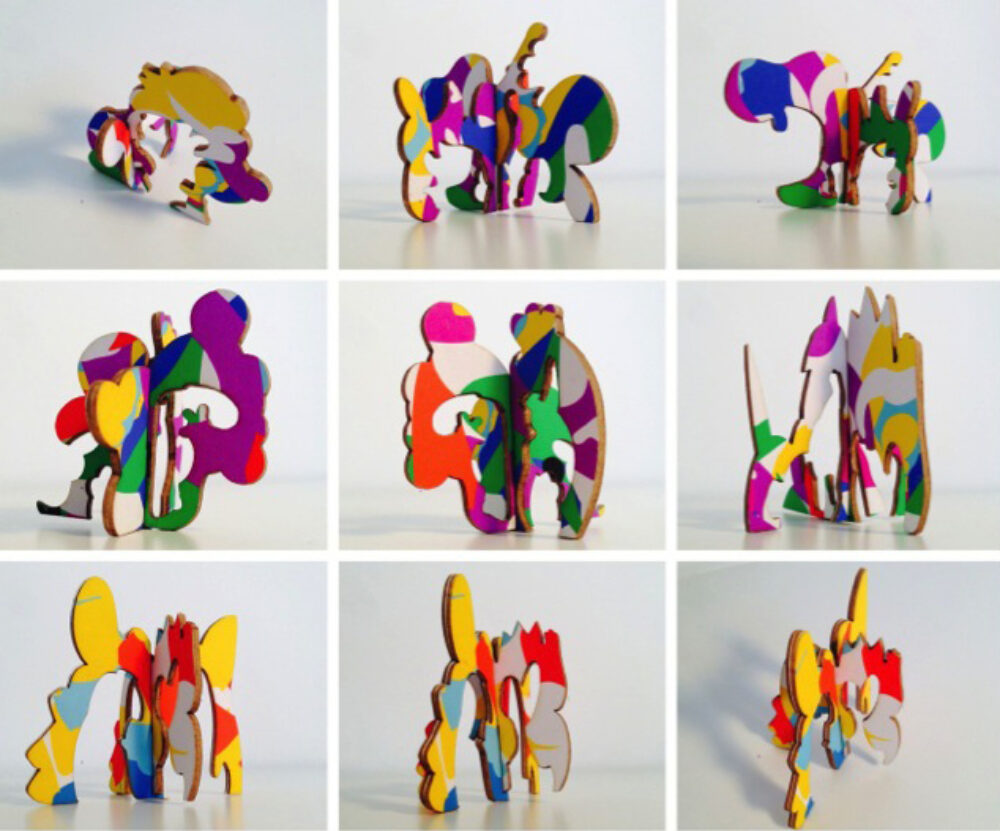
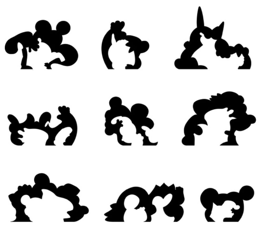
Balloon Frame is a space of delineated planes that outline the shape of a familiar, yet unrecognizable form. The project aims to echo contemporary pop culture, local street art and the vivid perceptual experiences of watching parade balloons. Our proposal is made up of ten intersecting vertical planes which are contoured along its outer edge and inner voids. It is simultaneously an open and continuous space as it is a series of “frames” and doorways that act as a backdrop for PS1’s summer weekend events and as a destination for everyday play. Each plane is surfaced with a vivid color rendition of an inflated and voluptuous three-dimensional form, challenging one’s perception of materiality while creating an immersive experience. The planes are the last iteration of a back and forth process where detailed and figural two-dimensional geometry is used to generate a balloon-like three-dimensional form. Horizontally the form is sliced at 18” above the ground to generate seating platforms, while the contours on the ground reflect what would be the shadow of the planes during a late afternoon in June. Balloon Frame looks to synthesize contemporary fabrication techniques with basic but innovative materials. In the same spirit of “balloon frame” construction that was developed to speedily construct lightweight framing to be lifted into place, Balloon Frame is prefabricated into large components and assembled on site. The color and graphic texture is printed on removable and recyclable vinyl which is then applied onto honeycomb torsion panels which can be re-used by industries such as door manufacturers and furniture fabricators. Structural steel is embedded within the honeycomb panels wherever the planes intersect as columns. The crisscross nature of the vertical planes describes the volume in its entirety, becoming a skeleton of a balloon-like form.
Maribor Housing Maribor, Slovenia 2111Ai 100YC Project Maribor City of Culture September, 2012


This proposal aims at introducing a color saturated image roof-scape to the city of Maribor in the form of NEW HOUSING and neighborhood CULTURAL CENTERS. Located in the current zone of industry, the development will begin along the River Drava and continue to fill in the entire area of industry. The roofs of the amassed buildings are a layer of colored ceramic tile where each tile is a pixel, completing a geological satellite image of the existing Maribor landscape. The formal disposition of buildings is derived from five primitive roof typologies of existing roof types in Maribor. Each primitive is re-shaped then merged and morphed into one another to create a new family of contemporary forms. Each building’s unique form aligns to the geometry of the adjacent buildings or is incongruently misaligned. These conditions create unexpected courtyards and open spaces to allow light and air through the buildings. As housing and shops line the streets, a cultural building (library, theatre, school, church) is located within a few miles from one another, forming neighborhood destinations within the old industrial zone. Seen from the river, the red clad roof-scape of the old town Maribor, extends to the NEW HOUSING, the previous site of obsolete industries, is now a site bustling with people and culture, with color saturated roof-scapes, and meandering landscapes.
Guggenheim Helsinki Helsinki, Finland Design Competition September, 2014
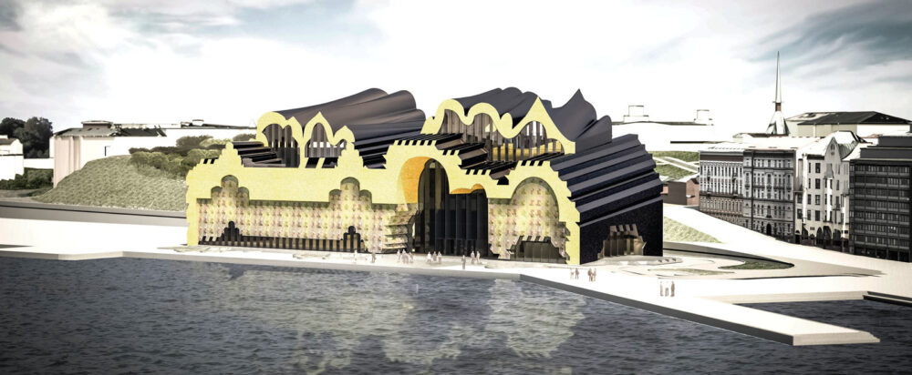
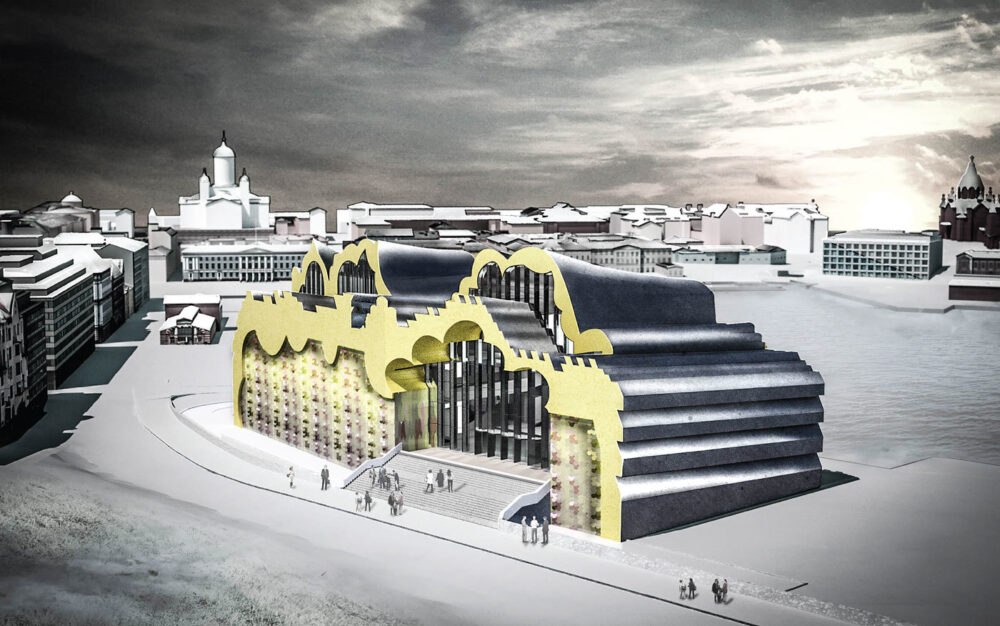
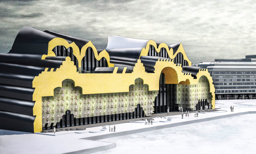

Our proposal for a Guggenheim Helsinki Museum is focused towards the intent to examine the historic fabric of Helsinki and to produce from it an unexpected experience and emblem for the city. A series of initial studies were made to extract delineation lines that make up Helsinki’s vertical (skyline) and horizontal (courtyard) contours. These existing contours of the city are broken apart, redrawn and fused together to produce a reimagined shape for the building. A figure ground study of the city revealed how light is capitalized on through inner courtyards and how the buildings have a strong presence along the street and property edge. Our proposal reformulates these conditions into a museum building with two internalized courtyards enclosed within a billowing roof, surrounded by four levels of museum amenities and gallery spaces that are covered with an irregularly serrated surface. This distinction between the atrium space and gallery perimeter produces a simultaneously blurred and acute visual experience, both on the exterior and interior. The duality of the multiple resolutions also occurs on the façade where a reference is made to the geometry of masonry bond patterns. The pattern is altered through scale, depth and color, to create a visually changing effect.
Taichung Cultural Center Taichung, Taiwan International Competition May, 2013


This proposal for the Taichung City Cultural Center is a singular, landmark building, which encompasses both the Taichung Public Library and the Taichung Fine Arts Museum. In response to Taichung City Government’s initiative to develop a notable entryway to Taichung Gateway Park, we propose a building that formally yields a “gateway” into the new park. Much like natural occurring openings between large rock formations, grand breezeways or tunnels are proposed to separate the two volumes of the library and museum. Through a series of studies and manipulations of historical archway precedents, a three-dimensional form of the tunnels was generated. The volumes of the library and museum extend to the boundary of the site and are truncated on three sides. The single flat facade along Park Avenue represents the building as a solitary cultural hub, whereas the other two flat facades which face the park, define the museum and library as separate entities. Also in contrast to the street facade, the majority of the glass on the museum and library facades are translucent as well as recessed to allow for shade from sun exposure coming from the south of the park. To complement the design of Taichung Gateway Park, the same language of curves that detail the concrete edge of the flat facades, define the shape of the lower shop and cafe buildings as well as the ground paving and landscape around the site. Inspired by the artist Michael Lin’s use of floral textiles in urban settings, we developed a graphic from the national Taiwanese flower to carpet the undulating roof. The roof is made up of colored metal or solar panels, that act as pixels of a complete image. This imagery is used to evoke a sense of nostalgia for Taiwanese history through drawing from traditional floral fabrics. The image and coloration also provides a dramatic visual impact of the building from afar and from above - especially when seen from the roof garden of Sou Fujimoto’s Taiwan Tower building.