The beams. The columns. The stairwells. The flooring. The steps to the street. The handrails. The restroom tiles. The cladding. The metal terraces. The mullions. Everywhere gray. Fifty shades of it, surely, maybe more. There are grays in the world that have depth, warmth—grays that you can lose yourself in. Indeed, gray—à la the Grays—has stood metonymically for architectural richness and complexity, combining both intellectualism and play. These grays are not those. These are cool, flat grays that sit on the surface, resisting penetration. These are grays that instantly ask you to forget them, grays meant not to draw the eye but to deflect it away to something else, deferring to something more important.
Indeed, this is an architecture that rebuffs the eye, a self-effacing architecture that privileges its surroundings and its contents altruistically over itself. And, some would ask, why not? The Renzo Piano-designed Whitney sits in one of the most energized quarters of Manhattan. Feeding off of the constant flow of humanity spilling out of the High Line, the Whitney practices a clever form of self-interested Good Samaritanism, transforming the sidewalk into a terraced public landscape, suffused with sociality and neon green chairs. The glass membrane separating lobby from terrace is stretched taut, willing in the crowds only to confront them with a ticket queue ten registers wide and four roped rows deep.
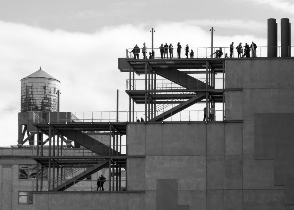
The recommendation is issued by rote: “Start at the top!”—the top being the location of a closed special exhibitions gallery, a closing café, and the clear destination: an outdoor terrace in galvanized gray that is not much more than a perch facilitating a spectacular photogenic panoramic view of lower Manhattan, bathed in the golden light of late afternoon. When does the spectacular become gratuitous spectacle? Perhaps when it is served up on every floor.
The experience of art at the Whitney—a wide ranging collection of American art, whose disparate threads are skillfully woven together by the very notion of plurality and difference in its inaugural show, America is Hard to See—is a thoroughly Postmodern form of disinterested contemplation in a state of distraction. One emerges onto each exhibition floor from the central core, then directed through galleries in a centrifugal trajectory. The rhythm of painting—painting—painting—self-important guy taking a selfie in front of a painting—painting—is interrupted by an expanse of glass, the discovery of an operable door, and the sudden heat and noise of the city. Admire the waterfront, turn and admire the skyline, admire oneself through the Apple looking glass and document that you’ve been there—now back into in the hushed white box, chatter dutifully swallowed, painting—painting—painting. This cycle, repeated on every floor, surreptitiously subverts one’s original purpose for showing up in the first place. Rather than absorbing oneself in the art, one is absorbed by the spectacle of the city, a surreal and lush experience of urbanity undulating outward and upward in slow motion. America (40.7732° N, 73.9641° W) turns out to be rather stiff competition for America.